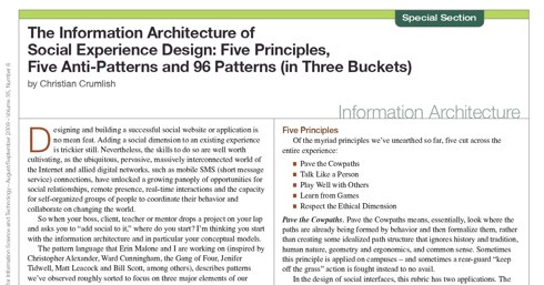
I have an article in the August/September 2009 issue of The Bulletin of the American Society for Information Science and Technology, called "The Information Architecture of Social Experience Design: Five Principles, Five Anti-Patterns and 96 Patterns (in Three Buckets)" (quite a mouthful, eh?).
I’d like to thank Stacy Surla, one of my colleagues on the board of the Information Architecture Institute, who saw Erin Malone and myself present an overview of the social design patterns project at the 2009 IA Summit and invited us to write an article for the Bulletin.
She gently shepherded and edited the draft and the results, I hope, present a useful taste of the depth of material in our upcoming book.
- A web version of my article (HTML)
- The print version of my article (PDF)
- The complete August / September Bulletin with full design (PDF)
- The current Bulletin issue (not a permalink)


Comments
6 responses to “The Information Architecture of Social Experience Design: Five Principles, Five Anti-Patterns and 96 Patterns (in Three Buckets)”
what ought I to do to engage and sustain a commenter culture on this site? call the community experts!
First thing to do, which is easy, is make “recent comments” appear at the top of your right-hand sidebar. Lets people know what the freshest conversations are.
Nice article Xian, really thought provoking and informative… great insight into how to go about formulating and adding that social dimension to existing experiences, which is the space many of us UX designers are finding ourselves in… :-)
Great wiki and cool approach to crafting your book.
Peace,
Rick
Thanks, Rick! It’s my pleasure. Writing the article was a challenging exercise in trying to extract something pithy from a 500 page book based on an open-ended several-year-long process. I’m happy it’s proving useful to you.
I loved reading the article yesterday on my metro ride back home (yes, I printed it :( ).
The examples you used and titles like “Pave the cowpaths” really make a difference and make it enjoyable to read.
Thanks, Daniel! I can’t really take credit for some of the catchier labels. The “pave the cowpaths” exhortation comes directly from the Microformats community. In general, though, I do agree that vivid clear metaphors help understanding a great deal!